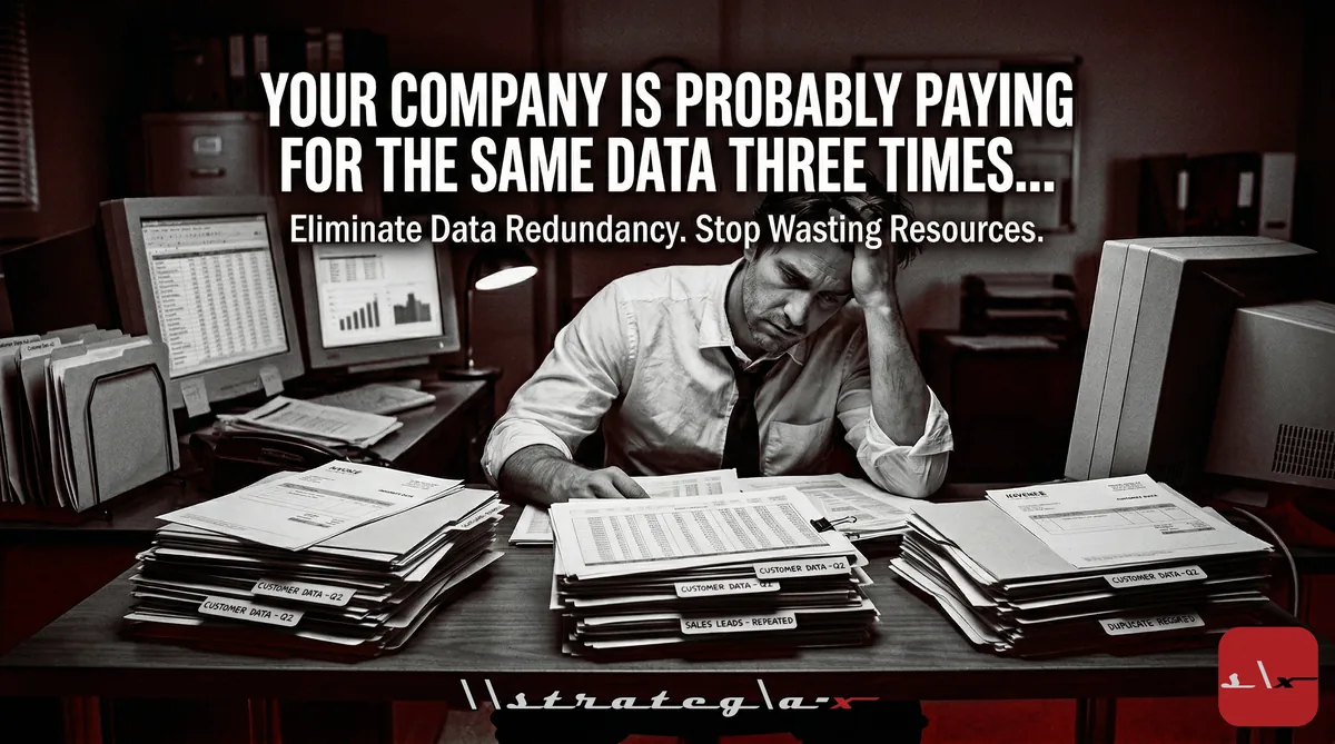
The Reformatting Tax Is a Solvable Operations Problem
Sprout Social's 2025 Platform Management Report put a number on something every content and marketing operations leader already knows intuitively: 218 hours per manager per year are lost to reformatting. Same design. Same message. Different pixel dimensions. No creative value created.
At a $75/hr blended rate, that is $16,350 per content manager per year, spent on format conversion. For a team of three, $49,000 annually allocated to a task that produces no business output.
This is not a talent or creativity problem. It is a systems problem. And it has a clean solution.
The One-Source Design Principle
The root cause of the reformatting tax is designing per-platform rather than per-message. Every piece of content starts from scratch for each distribution surface. The fix: design once at the master canvas level, then adapt, never rebuild.
The optimal master canvas for social content is 4:5 (1080×1350px). This format:
- Is Instagram's highest-performing feed format
- Crops cleanly to 1:1 (center crop) for universal fallback
- Extends to 9:16 for Stories, Reels, TikTok, and YouTube Shorts with background extension only
- Scales to 16:9 for X/Twitter with background extension
The single structural constraint that makes this work: all critical elements (logo, headline, CTA, core message) must live within the center 1080×1080px zone, the universal crop that survives every format conversion.
The 2026 Platform Dimension Reference
Using outdated specs is as common as it is costly. LinkedIn updated recommended specs in Q1 2026; Instagram deprecated the 1.91:1 landscape format for feed posts. Current confirmed specs:
- Instagram Feed: 4:5 (1080×1350px) primary, 1:1 (1080×1080px) secondary
- Instagram Stories / Reels: 9:16 (1080×1920px), safe zone center 1080×1420px
- TikTok: 9:16 (1080×1920px), safe zone center 1080×1420px (UI at top/bottom 250px)
- LinkedIn Feed: 1:1 or 4:5; 1200×627px for link previews
- YouTube Shorts: 9:16 (1080×1920px), same safe zone as TikTok
- X (Twitter): 16:9 (1600×900px) or 1:1 (1080×1080px)
- Facebook Feed: 4:5 for maximum coverage, 1:1 also works
- Pinterest: 2:3 (1000×1500px) standard; 9:16 for Idea Pins
The three-format set that covers 95% of distribution: 4:5, 9:16, and 1:1.
The Production Workflow
With a correctly structured master, the multi-platform conversion reduces to a single operation:
- Design master at 4:5, all critical elements in the center 1080×1080px safe zone
- Run Smart Resize (one command), generates all platform variants with proportional spacing preserved
- Review four platform-specific adjustments that require human judgment: text size for vertical formats (+15-20% for 9:16), CTA repositioning out of UI overlay zones, copy length per platform context, and platform-native elements (Story tap indicators, etc.)
- Batch export, all formats output simultaneously to labeled folders
Total time from master to 6 exported formats: 15-20 minutes instead of 60-90.
The Template Library That Scales to Teams
The one-source workflow reaches full operational efficiency when paired with an 8-type master template library:
- Announcement card, product updates, feature launches, news
- Stat/data highlight, metrics, industry data, social proof numbers
- Quote/testimonial, customer proof, thought leadership
- How-to/listicle, educational and tutorial content
- Product visual, product-centric promotional posts
- Event/webinar, date, speaker, registration CTA
- Before/after, case studies, transformations, comparisons
- Carousel end card, consistent brand closing frame
With pre-configured Smart Resize presets in each template, any team member, regardless of design experience, opens a template, updates content, runs resize, and exports all platform variants. No setup per use.
The Operational Outcome
Measured outcomes from teams operating one-source design systems:
- Per-post production time across all formats: 75 min → 15 min
- Weekly hours saved (5 posts/week): 5-7 hours per manager
- Annual time reclaimed per content manager: 260-364 hours
- Brand error rate (wrong colors, outdated logos, inconsistent fonts): drops to near zero, all formats originate from one locked master
- Visual consistency score: improves measurably because format drift (the subtle inconsistencies that accumulate when rebuilding per-platform) is eliminated
The recovered capacity reallocates to the activities that actually compound: content strategy, performance analysis, A/B testing, and community management.
Implementation
Lumina Studio's Brand Kit + Smart Resize system is the production infrastructure for this workflow. Configure the Brand Kit with master color system, typography presets, and logo vault. Build the 8-template library with locked/editable zones. Save Smart Resize presets per template. The one-time setup investment: 4-6 hours. The weekly time savings begin immediately and compound every week.
Full workflow walkthrough with platform specs and template structures: Lumina Studio blog
-Rocky
#ContentOperations #SocialMedia #DesignSystems #EngineeringDreams #StrategiaX